
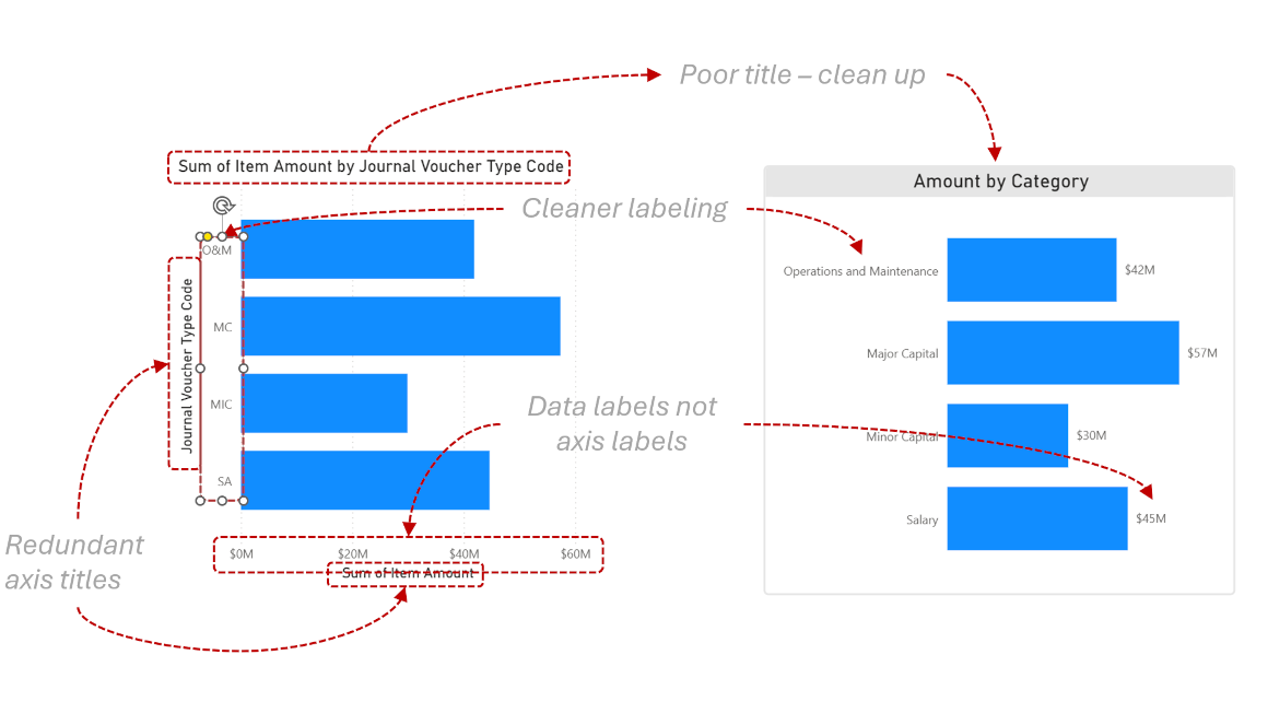
Technically Correct, Visually Broken: Why Perfect Dashboards Still Fail
Why do technically perfect dashboards still fail? Discover the hidden traps of data visualization and why visual literacy is entirely separate from tool fluency.
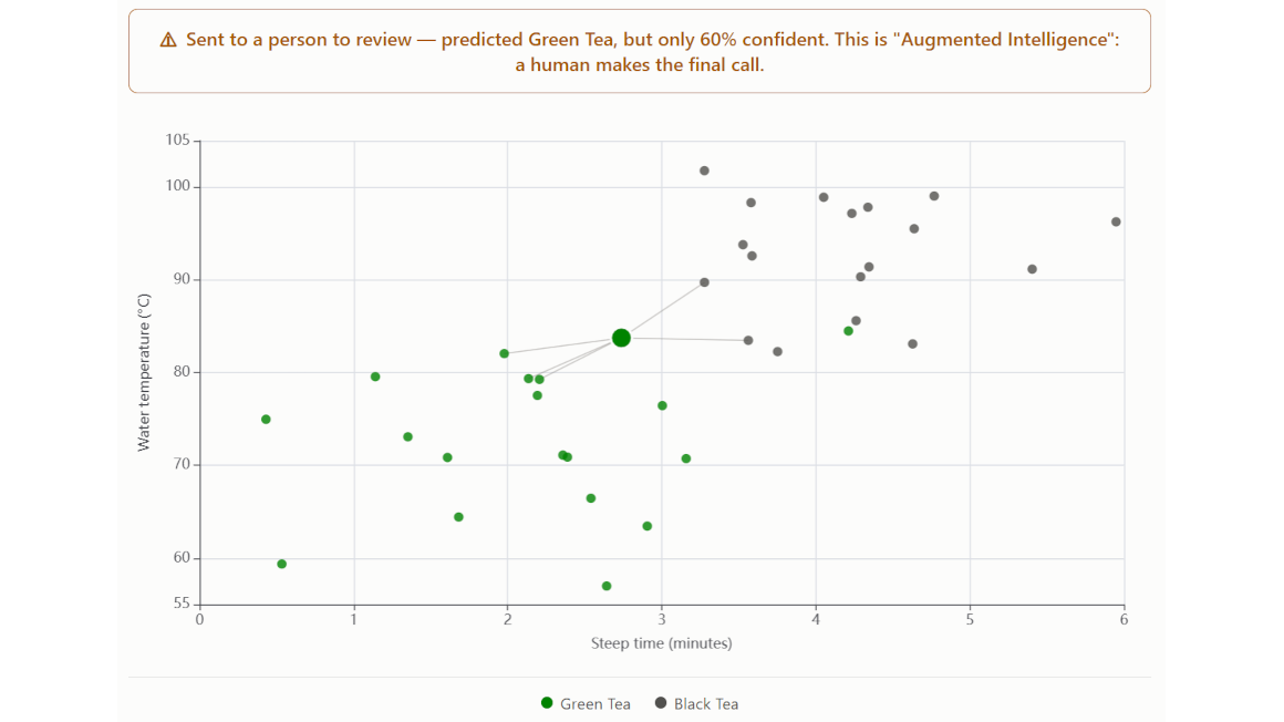
The Threshold Is Lying to You: Why 'Automated' Isn't the Same as 'Assessed'
A system that crosses a confidence line and decides on its own isn't wrong to trust — it's untested. Here's how that line should actually get drawn.
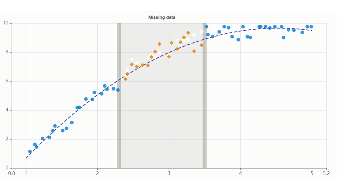
"The Gap Isn't Always Lying to You" — Missing Data & When & When Not to Impute
Filling in missing data isn't always safe — sometimes the gap itself is the finding.
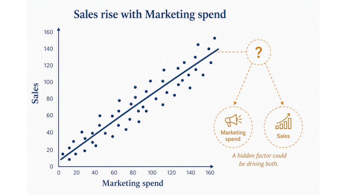
"The Trend Line Is Lying to You" — Correlation vs. Causation
How confounders, reverse causation, and coincidence fool you
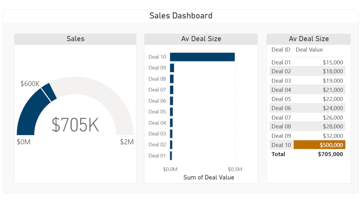
“The Dashboard Is Lying to You” — How One Outlier Skews Everything
A single bad data point can double your dashboard's average and still hide in plain sight.
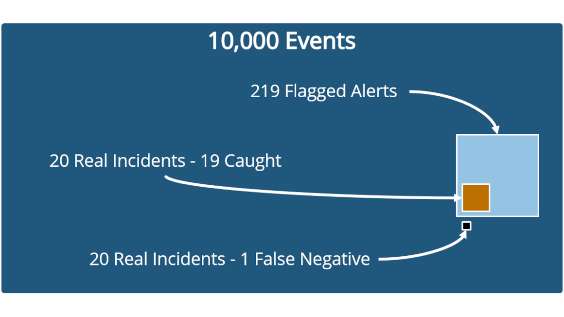
"The Alarm Is Lying to You" — Base Rates & the Positive-Test Paradox
A security tool that's 95% accurate can still be wrong 9 times out of 10.
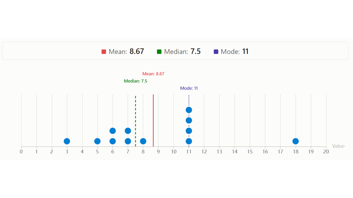
“The Average Is Lying to You" — Mean / Median / Mode
Everyone defaults to the average - don’t!
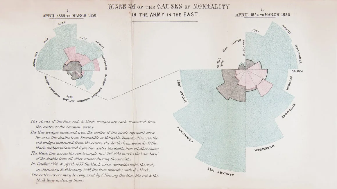
Data Visualizations that Changed History
It all begins quite a long time ago