
“The Dashboard Is Lying to You” — How One Outlier Skews Everything
The Dashboard Is Lying to You
We've already seen one way a single value can quietly take over a number: when the mean and median tell two different stories, one salary can drag a whole team's "average" miles from where anyone's actual paycheque lands. This time it's not the average that's the problem — it's the fact that most dashboards only ever show you one number at all, and one strange data point is often enough to make that number worthless without anyone noticing.
Here's the uncomfortable part: the fix that protects you from this is often the same fix that lets the bad data point keep hiding.
NOTE: If you don’t want to read the whole article you can just click to use the Interactive Outlier Tool.
Two kinds of outlier
Not every unusual value is the same kind of problem, and treating them identically is the actual mistake:
Genuine extreme values — real, correct data that's just unusually large or small. The $195,000 founder salary from the last article was one of these: real, correct, and simply not representative of the team.
Data errors — a value that's wrong. A typo, a misplaced decimal, a unit mismatch, a duplicate record, a system glitch. This isn't an unusual-but-true data point — it's incorrect data sitting in your system, quietly corrupting every report, rollup, and forecast that touches it.
A genuine extreme value needs a better statistic — median instead of mean, for instance. A data error needs to be found and fixed at the source. Reaching for a more robust statistic solves the first problem. It does nothing for the second — and worse, it can actively hide it.
How do you actually know it's an outlier?
The examples on this page are deliberately obvious — a half-million-dollar deal sitting next to nine ordinary ones is easy to eyeball. Real outliers usually aren't, which is why there are quantitative tests for how likely a point actually is one, rather than relying on a number just looking wrong:
Beyond the 1.5× IQR whiskers. Sort the data, find the interquartile range (the middle 50% of values), and flag anything more than 1.5 times that range past the first or third quartile. This is the same rule that draws a boxplot's whiskers — points outside them are the ones a boxplot marks as individual dots.
More than 2–3 standard deviations from the mean. The classic bell-curve test, and the most commonly quoted one. It has a blind spot worth knowing about, below.
A modified z-score, built from the median instead of the mean. For skewed data — data that already has a real outlier sitting in it — the mean and standard deviation are themselves dragged around by the same value you're trying to test, so a standard z-score can understate how extreme a point really is. Swapping in the median and the median absolute deviation (MAD), which barely move, gives a more honest read.
There are others too — a point unusually far from a fitted trend line is the same idea applied to time series or regression data — but IQR, standard deviation, and the modified z-score are the three worth having in your back pocket.
The deal-size example
Say a ten-person sales team closes ten deals this month. Nine are ordinary: $15,000 to $32,000. The tenth should have been a $50,000 deal — a decent result, nothing unusual — but whoever logged it in the CRM added an extra zero. It's sitting in the system as $500,000.
Here is what one wrong digit does to the dashboard:
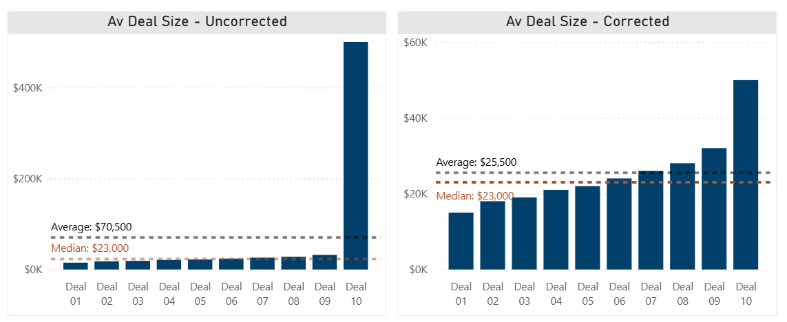
Uncorrected vs Corrected data for Deal Size
| With the typo | Corrected | |
|---|---|---|
| Average deal size | $70,500 | $25,500 |
| Median deal size | $23,000 | $23,000 |
The typo doesn't just nudge the average — it triples it. A sales leader glancing at "Average Deal Size: $70,500" would reasonably think the team just had an outstanding month. It didn't. One keystroke did.
Now here's the twist. If this dashboard had been built sensibly — showing median instead of mean, exactly the fix the last article recommended — the number would have read $23,000 the whole time, typo or no typo. Correcting the $500,000 back to $50,000 doesn't move the median at all. Which means: nobody looking only at a median-based dashboard would ever have had a reason to notice that error existed. It would sit there, uncorrected, feeding into commission calculations, quarterly forecasts, and anything else that touches that record — invisible, because the dashboard was doing exactly what it was designed to do.
Median protects a summary number from an outlier. It does not protect your data from an error. Those are different jobs, and a dashboard that only does the first one can leave the second one undone indefinitely.
Running the tests on the $500,000 deal
Applying the three tests from above to the ten deals shows why it's worth knowing more than one of them:
| Test | Result with the typo in place | Verdict |
|---|---|---|
| 1.5× IQR fence | Upper fence = $44,000 (Q3 of $29,000 + 1.5 × an IQR of $10,000) | $500,000 is more than 10x past the fence — flagged, easily |
| Standard deviation | Mean $70,500, standard deviation ≈ $151,000 → $500,000 sits ≈2.8 SD out | Flags at a 2 SD threshold. Does not clear the commonly-used 3 SD threshold |
| Modified z-score (median-based) | Median $23,000, MAD $5,000 → modified z-score ≈ 64 | Flagged so hard it isn't a close call |
How this looks in other departments
The same pattern — one strange value quietly overpowering an average — shows up anywhere a dashboard rolls many records into one number.
| Department | The outlier | Average | Median | How much the average moved |
|---|---|---|---|---|
| Finance | One deal logged as $500,000 instead of $50,000 | $70,500 | $23,000 | 3.1x the median |
| HR | One executive search that took 270 days against nine roles filled in 18–35 days | 50 days | 27 days | 1.9x the median |
| IT | One major incident resolved in 504 hours against nine tickets closed in 1–9 hours | 55 hours | 6 hours | 10x the median |
| Real property | One building's $310,000 roof replacement against nine buildings at $8,000–$24,000 upkeep | $45,400 | $17,000 | 2.7x the median |
The IT row is the sharpest example on this list — a single major incident inflates "average resolution time" by a full order of magnitude, which is exactly the kind of number that ends up in a board slide making a team's whole quarter look like it missed its SLA, when in fact nine out of ten tickets were resolved same-day.
So what do you actually do about it?
| If the outlier is… | Then… | Because… |
|---|---|---|
| A genuine extreme value | Report a statistic that isn't dragged around by it — median over mean, or show both | The value is real; the problem is only which summary number you're leading with |
| Likely a data error | Go find the actual record and fix it — don't just pick a more robust statistic and move on | A robust statistic hides the error from the dashboard; it doesn't remove the error from your data |
| Something you can't tell without checking | Check it before trusting either the number or your instinct to ignore it | A dashboard has no way to tell you which kind of outlier it's looking at — only you can |
The habit worth building isn't "always use median" or "always investigate outliers." It's noticing when a single value is doing most of the work in a number you're about to make a decision on — and asking whether that value is a fact about your business or a mistake in your system before you act on either one.
Try it yourself
Below is the link to the interactive tool (or open in a new tab), see if you can identify outliers manually and look at how the different statistical tests work with different types of data.
Where this shows up beyond the dashboard
This is the same judgment call we've pointed at twice now — with mean, median, and mode, and with base rates and false alarms — because it's really one underlying skill: knowing what a number is actually made of before you trust it. If your team reports on deal sizes, hiring timelines, incident response, or facilities spend and you've never asked what a single unusual month would do to that number, it's worth a look.
You'll find more of these interactive concept demos — descriptive statistics, base rates, regression versus causation, and others — at tools.davhill.com.
Stephen Davies, DAVHILL Group. Connect on LinkedIn.