
Technically Correct, Visually Broken: Why Perfect Dashboards Still Fail
Somewhere in your organization, there's a report built by someone genuinely good at their job. The data is right, the query is efficient, the layout is clean—and it still doesn't land.
It isn't because there's anything wrong with the tool. It’s because visualization is its own distinct skill, completely separate from platform fluency, and it fails in more places than most builders realize.
That's the premise of our new series, Can You Picture... This isn't a collection of "here's a statistic that misleads you" examples (we have a different set of articles for that). This series targets the layer underneath the statistic: what your visual system does with a chart before you consciously read it, and just how many places a perfectly built report can quietly lose its reader.
Four stages, and a trap waiting at every one
Visual perception isn't a single step; it's a sequence. It’s the exact same sequence we teach in DAVHILL's Storytelling with Data course. Each stage happens before you are consciously aware of it, and each has its own way of going wrong.
Here is a fast, incomplete tour of those four stages. There is a lot more to say about all of them—which is exactly why we are writing this series.

From retina to reason
1. Raw Visual Input What your eyes register before your brain does anything with it.
Categories distinguised by colours that are not colour impairment safe.
Contrast too low to distinguish the information from the background noise.
3D effects that distort edges that deliniate different charts or parts of the page.
Distracting optical effects accidentally introduced that distort or distract the information presented.
2. Pre-attentive Processing The handful of features your brain scans for instantly, before focused attention arrives.
Five things fighting for the eye's attention when only one matters.
Colour, bold text, and size all deployed at once, so nothing actually pops.
Enclosing features that draws attention to features that are not important.
Emphasis added to numbers that are fine, while leaving it off the one that isn't.
3. Gestalt Organization How your brain groups marks into shapes before you've "read" anything.
Bars sorted alphabetically instead of by the value that actually matters.
Unrelated figures placed close together, implying a relationship that isn't there.
The same colour meaning something different from one page or report to the next.
A line drawn through discrete data, implying a continuous trend that does not exist.
4. Attentive Cognition The stage where deliberate reading and reasoning finally begin, three unconscious stages later.
A second axis quietly rescaled so two unrelated lines appear to move together.
An overcrowded page that has no structure, confusing the reader.
A cherry-picked date range that flips the story the full range would tell.
A number the reader has to do mental subtraction to get, when the chart could have just shown the variance.
So, what do you actually do about it?
| If… | Then… | Because… |
|---|---|---|
| A chart "looks fine" to the person who built it | Get it in front of someone who didn’t build it before it ships. | The builder’s own eyes already resolved every ambiguity — that’s exactly why they can’t see the failure a fresh reader hits immediately. |
| Your team is confident in the platform but hasn’t trained the eye | Treat visualization literacy as its own trained skill, not a byproduct of tool fluency. | Every trap listed above happens the exact same way regardless of which software produced the chart. |
| You don’t know how many of these traps are live in your reporting | Run a handful of your real dashboards past someone who knows what to look for. | Most visualization failures are quiet. Nobody complains about a bad chart; they just quietly stop trusting it or using it. |
Try it yourself
This site now features live, interactive demos covering more of the traps above than you'd expect. We built them to let you test your own eye, not just read a list. You can explore all of them at tools.davhill.com.
Later pieces in this series will take individual traps from the list above and break them down in depth. If you'd rather build this skill directly with your team instead of piecing it together article by article, that's exactly what DAVHILL's Storytelling with Data course is built to do.
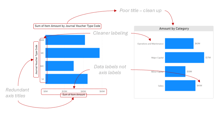
Before and after tidy up of a chart
Where this leaves you
Tool fluency is real and valuable, and this article isn't arguing against it. It's arguing that fluency answers a completely different question than the one that actually decides whether a report lands. The critical question isn't "can you build this?"—it's "will the eyes reading it see what you meant them to see?"
That question gets answered before conscious thought even starts, on hardware no platform update can touch. As we've seen, it has sixteen-plus ways to go wrong before you even get to whether the data itself is right.
The rest of this series will walk through these traps one at a time, using our own interactive tools. Can you picture a chart your team shipped last quarter that was technically correct, but still didn't land?
Can you guess which trap it hit?
— Stephen Davies, DAVHILL Group. [Connect on LinkedIn]