
“The Average Is Lying to You" — Mean / Median / Mode
Ask someone what the "average" salary is at their company, and they'll usually rattle off a number without thinking twice. It sounds precise. It sounds objective. It's also, very often, a number that describes almost nobody.
Here's a real shape this takes. A ten-person team has nine people earning between $52,000 and $65,000. One person — the founder — earns $195,000. Add it up, divide by ten, and the "average salary" is $71,900. Not one person on that team actually earns that. The number is technically correct and practically useless.
This isn't a trick question or a rounding error. It's what happens every time we reach for "the average" — the mean — without asking whether it's the right tool for the data in front of us.
NOTE: depending on the software that you are using, especially if you are using auto lines in charts it might use the word “Average” instead of “Mean”. This is fine, usually this is interchangable but techinally Mean, Median and Mode are different types of Mathematical Averages - there are in fact others that we are going to ignore for now!
Three numbers, one word
We use "average" loosely to mean three different things, and they don't always agree with each other:
Mean — add everything up, divide by how many there are. Sensitive to every value, including extreme ones.
Median — sort the values and pick the middle one. Only cares about position, not magnitude — so one outlier can't drag it around.
Mode — the value that shows up most often. Useful when you care about what's typical, not what's average.
NOTE: Later on in this article we point you to a DAVHILL interactive tool to explore just this. If you don’t want to read the artice and just try the tool click on the Descriptive Statistics Tool link.
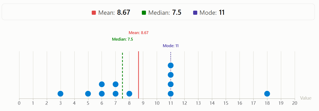
12 data points, different Mean, Median and Mode
When the mean breaks: compensation
Back to that ten-person team. Here's the actual data:
Salary values: $52,000 | $54,000 | $55,000 | $57,000 | $58,000 | $59,000 | $61,000 | $63,000 | $65,000 | $195,000 (founder)
Mean: $71,900. Median: $58,500.
The median sits right in the thick of where eight of the ten salaries actually fall. The mean doesn't sit near anyone — it's been pulled almost $13,400 higher than reality by a single value. If you're one of the nine employees on that team, "the average salary here is $71,900" tells you nothing true about your own paycheque. "The median is $58,500" does.
This exact pattern shows up constantly outside of pay data too: a handful of large enterprise contracts inflating "average deal size" past what a typical sale looks like, a couple of hard-to-fill specialist roles blowing out "average time-to-hire," a few chronically late accounts wrecking "average days to payment." Anywhere a small number of values sit far from the rest, the mean quietly stops representing the middle — and the median takes over as the more honest number.
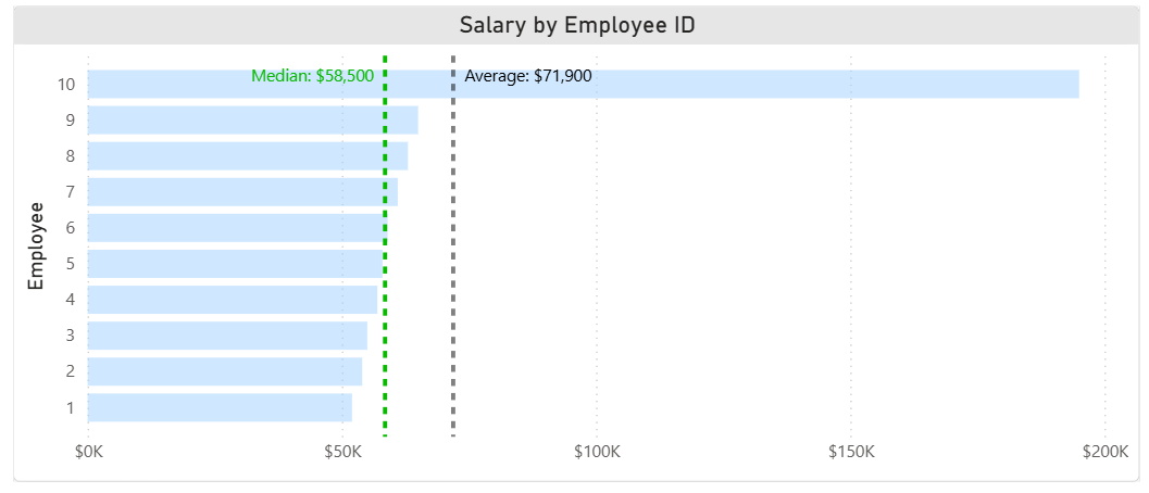
Median and Average (Mean) of Salary Data
The one everyone forgets: mode
Median fixes the outlier problem. But sometimes what you actually want to know isn't "what's the middle value" — it's "what does most of this look like." That's mode's job, and it rarely gets used.
Take vacation requests. Over a year, one team logs 60 PTO requests ranging from 1 to 15 days. The mean length is skewed upward by a handful of two- and three-week block requests. But look at what people actually ask for most often:
| Request length | Number of requests |
|---|---|
| 1 day | 6 |
| 2 days | 9 |
| 3 days | 11 |
| 4 days | 7 |
| 5 days | 18 |
| 6 days | 3 |
| 10 days | 4 |
| 15 days | 2 |
The mode is 5 days — a single workweek, by far the single most common request. That's a far more useful planning number than a mean pulled upward by a few long block requests: if you're building coverage plans around what "a typical absence" looks like, the mode tells you to expect one-week gaps as the norm, not the exception. Mean and median can both be true numbers and still miss that pattern entirely, because neither one is answering "what happens most often" — only mode does.
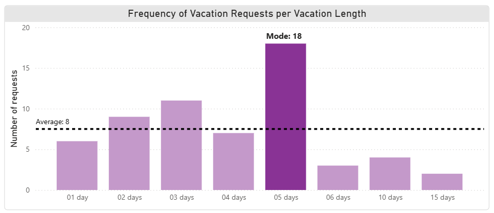
Average (Mean) and Mode of Vacation Requests
So which one should you actually report?
| If you're looking at… | Lead with… | Because… |
|---|---|---|
| Data with a few extreme values (pay, deal size, payment times) | Median | It isn't dragged around by outliers |
| What's typical or most common (request patterns, order sizes, ticket categories) | Mode | It answers "what usually happens," not "what's in the middle" |
| Tightly clustered, roughly symmetric data with no real outliers | Mean | All three usually agree closely here, so mean is fine — and familiar |
The honest answer, most of the time: report more than one, and say which you're using and why. "The average salary is $71,900" and "the median salary is $58,500, though one senior salary pulls the average up to $71,900" are two very different conversations to walk into.
Try it yourself
Numbers on a page only go so far. Below is the same idea, live — drag the points around, add or remove them, and watch mean, median, mode, range, standard deviation, and the interquartile range all respond differently to the same change. If you want to try the tool on a new tab rather than in an iFrame click here https://tools.davhill.com/charts/descriptive-stats/
Try this: add one point far to the right of the rest and watch what happens below the chart. The mean jumps. The median barely moves. If a few points cluster tightly together, watch the mode light up on that cluster while mean and median sit somewhere else entirely. That gap is the whole article, made tangible.
Where this shows up beyond the spreadsheet
This isn't just a spreadsheet problem. In the early 1950s, the U.S. Air Force had a run of unexplained crashes it couldn't pin on pilot error or mechanical failure. An engineer named Gilbert Daniels was asked to check a simpler theory: maybe the cockpits — designed years earlier around the dimensions of the "average pilot" — just didn't fit real people anymore. He measured 4,063 active-duty pilots across ten body dimensions that mattered for cockpit fit, then checked how many of them fell within the "average" range on all ten. The answer: zero. Not one pilot out of 4,063 was actually average.

World War 2 cockpit design
The cockpit had been engineered for someone who didn't exist, and every real pilot flying it was flying a seat, stick, and pedal layout built for nobody in particular. The fix wasn't a better average — it was adjustable seats, pedals, and harnesses, because the entire premise of designing around a single average was the flaw. (This story is well documented in Todd Rose's The End of Average*, drawing on Daniels' original 1952 research — worth a read if it resonates.)*
Swap "cockpit" for "compensation band," "onboarding flow," or "dashboard default," and the same failure shows up constantly in business data: design or report around the average, and you've optimized for a person who isn't actually there.
This is exactly the kind of judgment call we want to make people aware of - not just computing the right number, but choosing the one that tells the truth to the audience in front of you. If this is the sort of thing your team runs into when reporting comp, pipeline, or operations numbers, it's worth a look.
You'll find more of these interactive concept demos — sampling methods, outliers, regression versus causation, and others — at tools.davhill.com.
Stephen Davies, DAVHILL Group. Connect on LinkedIn.