
"The Trend Line Is Lying to You" — Correlation vs. Causation
The Trend Line Is Lying to You
We've already looked at how a single bad data point can quietly take over a dashboard number. This time the problem isn't a bad data point at all — every number involved can be completely correct, and the chart can still lead you somewhere wrong. Two things moving together on a chart is one of the most persuasive-looking shapes in all of data analysis. It's also one of the easiest to misread, because a rising trend line answers the question "do these two things move together?" and silently implies an answer to a completely different question: "does one of them cause the other?"
Here's the uncomfortable part: the more confidently a correlation is presented, the less likely anyone stops to ask which question actually got answered.
NOTE: This article contains an interactive tool that you can use to play around with some different concepts. If you don’t want to read the article and go straight to the tool check it out here on https://tools.davhill.com/charts/regression-correlation/
Four ways a correlation can mislead you
A real, statistically solid correlation between two things can show up for reasons that have nothing to do with one causing the other:
A confounding variable — a third factor drives both measures at once, so they move together even though there's no direct link between them. This is what's really going on whenever people or records sort themselves into a group based on a trait that also happens to predict the outcome — the sorting isn't random, and the data is complete, but a hidden cause is pulling on both ends.
Reverse causation — the story is being told backwards. What looks like "A causes B" is actually "B causes A."
Coincidence — check enough pairs of numbers against each other and some will correlate by chance alone, with no story behind them whatsoever.
A selection effect — the data itself is missing part of the picture. Whoever or whatever didn't make it into the sample — people who dropped out, didn't respond, or were filtered out before anyone looked — is missing in a way that's tied to the very thing being measured.
Any of these four can produce a chart that looks exactly as convincing as a genuine cause-and-effect relationship. The chart itself can't tell you which one you're looking at — only checking can.
The leadership-training example
Say HR notices that employees who complete an optional leadership-training program get promoted at twice the rate of employees who don't: 40% versus 20%, across 60 employees over the past two years. That's a real, correctly-calculated number, and it's the kind of result that gets a training budget renewed on the spot.
Here's the same 60 employees, broken down by their prior performance rating before anyone took the training:
| Performance tier | Promoted (trained) | Promoted (didn't train) |
|---|---|---|
| High performers | 8 of 14 (57%) | 3 of 6 (50%) |
| Medium performers | 2 of 8 (25%) | 3 of 12 (25%) |
| Low performers | 0 of 3 (0%) | 1 of 17 (6%) |
(The low-performer row is worth a caveat: only 3 low performers took the training at all, so that 0% is a tiny sample doing a lot of talking, not a real signal either way. The high- and medium-performer rows carry the actual argument.)
Inside every single tier, training barely moves the promotion rate at all — a few points either way, well within noise. The training isn't what's driving the 40%-versus-20% gap. What's driving it is who signs up: 70% of high performers opted into the optional training, versus 40% of medium performers and just 15% of low performers. The people most likely to get promoted anyway were also the people most likely to take the class. Stack all three tiers together without accounting for that, and the training looks twice as effective as it actually is.
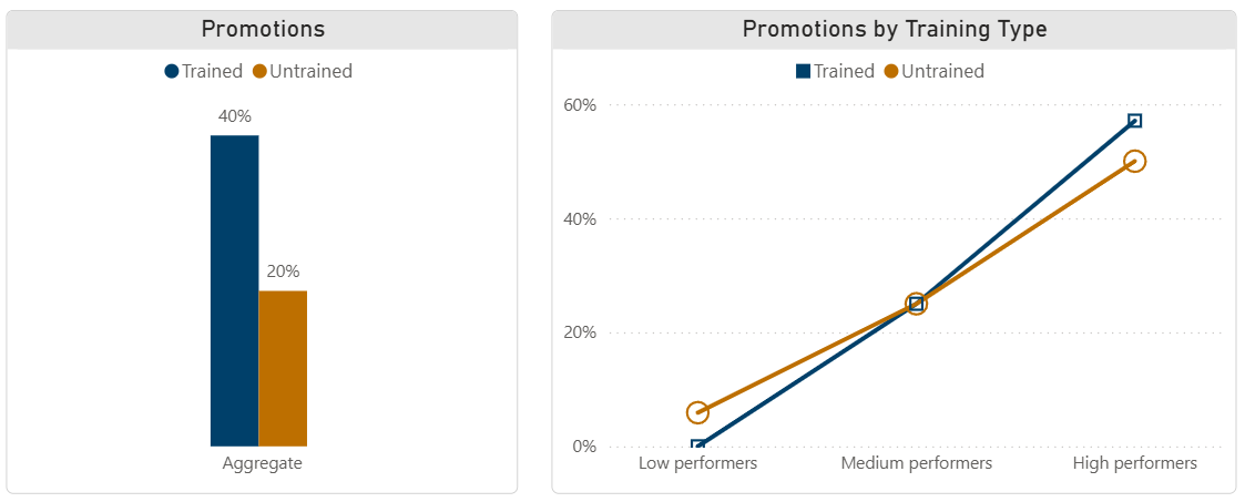
A 40%-vs-20% gap on the left. Split by performance tier on the right, and it's mostly gone
There's a name for this kind of chart: an interaction plot. The rule for reading one is simple — if the two lines run roughly parallel, whatever's on the x-axis is doing the work, and the thing separating the two lines isn't adding much on top of it. If training were actually driving promotions, you'd expect the trained line to pull steadily away from the untrained line as performance tier rises — a gap that grows in one direction. Instead the two lines sit close at every tier, and the small gap between them flips sign rather than growing: untrained is slightly ahead at the low end, they're dead even in the middle, trained edges ahead at the high end. That's the signature of noise, not a training effect.
This is a confounding variable, and it's one of the hardest correlation traps to catch, because nothing about the original 40%-vs-20% number is mathematically wrong, and nobody's missing from the data — all 60 employees are right there. The error isn't in the arithmetic, and it isn't in who got counted. It's that prior performance (or whatever underlying trait actually drives it — ambition, conscientiousness, doesn't much matter which) was quietly driving both who signed up for training and who got promoted, the whole time.
How this looks in other departments
The same shape — a real correlation, a misleading story about what's causing it — shows up anywhere someone compares two numbers without asking how each group ended up the way it did.
| Department | The correlation | The likely real explanation | The trap |
|---|---|---|---|
| HR | Employees who complete optional leadership training are promoted at 2x the rate of those who don't | Prior performance drives both who signs up for the optional training and who gets promoted; within each performance tier, training barely moves the promotion rate | Confounding variable |
| Finance | Quarters with higher marketing spend show higher deal-closing revenue | Marketing budgets are set from the previous quarter's sales forecast — strong sales create bigger budgets, not the other way around | Reverse causation |
| IT | Out of 40 metrics tracked on the ops dashboard, ticket-queue length happened to track almost perfectly with quarterly revenue | Check enough metrics against enough other metrics and something will correlate by chance alone — this is exactly what that looks like | Coincidence |
| Real property | A tenant-satisfaction survey comes back 92% positive across the portfolio | The survey only reaches tenants who are still there to answer it — tenants who moved out specifically because they were unhappy were never in the sample at all | Selection effect |
Finance's version is worth sitting with for a second, because it inverts the story most people would tell instinctively. "More marketing spend drives more sales" feels obviously true — but if budgets get set based on the previous quarter's momentum, causation is actually running in the opposite direction from the one the trend line seems to suggest.
So what do you actually do about it?
| If the correlation could be… | Then… | Because… |
|---|---|---|
| A confounding variable | Look for a third factor that could be driving both measures, and check whether the relationship holds within groups of that factor | Two things can move together because a shared cause is driving both, not because one causes the other |
| Reverse causation | Check which measure could plausibly have happened first | The story can run backwards from how it's usually told, and the data alone won't tell you which direction is real |
| Coincidence from checking many things | Ask how many other relationships were tested before this one turned up | Test enough pairs of numbers and some will correlate by chance alone, with no story behind them at all |
| A selection effect | Ask who or what didn't make it into the data at all, and whether that's tied to the outcome | The sample may not represent the population you think it does — the people or records that dropped out, didn't respond, or weren't tracked can be exactly the ones who'd have told a different story |
| Genuinely worth acting on | Run a real test — a controlled comparison, a pilot with a proper control group — rather than trusting the correlation alone | Only a designed test, not an observed pattern, can actually tell you whether changing one thing changes the other |
The habit worth building isn't "distrust every correlation." Most correlations people report are perfectly real relationships — the question is never whether the numbers move together, it's why. Before a correlation drives a decision, it's worth a minute asking which of these four is doing the work, or whether it's actually the fifth option: a genuine cause-and-effect relationship that would survive an honest test.
Try it yourself
Below is an interactive tool that lets you play around with different ideas. First look at the tab that is marked “confounding variable”. The slider effectively makes the effect stronger or weaker (more or less of an interaction), look what happens when you make the effect strong, you get a very strong correlation between the two variables! If you want to open the tool in a new tab click here.
Also try out the other tabs to learn more about regression, correlation and causation, it’s easy to get caught out for a lot of different reasons!
Where this shows up beyond the dashboard
This is the same underlying skill we've pointed at twice now — with mean, median, and mode, and with a single bad data point quietly running a dashboard — because it's really one habit worn three ways: knowing what's actually behind a number before you trust it. If your team has ever greenlit a program, a policy, or a budget shift on the strength of "look, these two numbers move together," it's worth a second look at which of the four traps above might be doing the driving.
You'll find more of these interactive concept demos — descriptive statistics, base rates, outliers, and others — at tools.davhill.com.
Stephen Davies, DAVHILL Group. Connect on LinkedIn.