
"The Gap Isn't Always Lying to You" — Missing Data & When & When Not to Impute
We've spent the last article on lines that move together for the wrong reason. This one is about the opposite kind of problem — not what's sitting in your data, but what isn't. A blank cell, a missing row, a sensor reading that never arrived: every dataset has gaps, and the instinct with a gap is almost always the same one — fill it in, smooth it over, keep the report moving. Sometimes that instinct is exactly right. Sometimes it's the single most damaging thing you can do to the number.
The uncomfortable part is that a gap doesn't announce which kind it is. You have to go looking.
NOTE at the end of this article you get to use an interactive tool that allows you to test different kinds of imputation. If you don’t want to read the article (or read it later) you can go straight to the tool here https://tools.davhill.com/charts/imputation/
Two kinds of missing data
Before you fill anything in, there's one question worth asking: would this value have looked ordinary if you'd actually seen it?
A structural gap — the data's missing for a reason that has nothing to do with its own value. A sensor's WiFi dropped, a monitoring agent restarted, a form crashed mid-submit. The true value still would have looked like its neighbors; it just never got recorded.
A meaningful gap — the data's missing because of something about the value itself. No exit interview because the departure was contentious. No expense report because a submission pipeline quietly broke for exactly one team. Here, the absence isn't noise — it's evidence.
Get this diagnosis wrong in either direction and you do real damage: fill in a meaningful gap and you erase the one thing worth noticing; leave a structural gap unfilled and you let a technical blip distort trend lines, averages, and anything automated that reads off them.
When the gap is the story: HR's exit interviews
Say an HR team runs 140 exits over the year and manages to complete an exit interview for 112 of them — 80%. The other 28, 20%, never happen: the employee left too fast, declined, or the meeting simply never got booked.
Among the 112 completed interviews, the stated reasons break down like this:
| Reason | Count |
|---|---|
| Retirement | 18 |
| Relocation – personal | 22 |
| Better opportunity – compensation | 42 |
| Management or team conflict | 30 |
Management or team conflict comes out to 30 of 112 completed interviews — about 27% of stated reasons. On its own, that looks like a solid number. But it only covers the 112 people who had an interview, and there's a strong reason to think those 112 aren't a fair sample of all 140.
HR separately tracks something that doesn't depend on an interview happening at all: whether a departure was flagged "no notice given" in the HRIS.
Missing interview (28 people): 19 flagged no-notice — 68%
Completed interview (112 people): 9 flagged no-notice — 8%
That's an eight-fold gap. Missing interviews are overwhelmingly concentrated among the departures that happened fast and messily — and fast, messy departures are exactly the kind most likely to be conflict-driven, not a retirement or relocation someone had time to plan and discuss calmly.
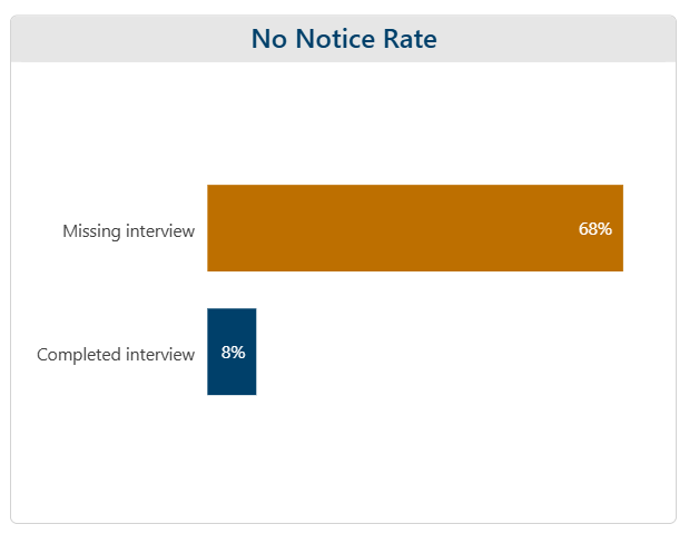
The missing 28 aren't random. Two-thirds of them left with no notice at all.
This is exactly why imputing here would be a mistake, not a shortcut. Averaging in a guessed reason for those 28 people — or worse, just quietly excluding them and reporting 27% as "the" conflict rate — doesn't just lose 28 data points. It specifically erases the group of departures HR most needs visibility into. The right move isn't a formula. It's to go find out what actually happened to those 28 people, because the gap itself already told you where to look.
When the gap is just noise: a building's temperature sensor
Now the opposite case. A building's HVAC system logs indoor temperature once an hour. Overnight, a WiFi gateway reboots for scheduled maintenance and knocks out three consecutive readings — 2:00, 3:00, and 4:00 AM are blank. The last good reading, at 1:00 AM, was 18.2°C. The next one, at 5:00 AM, was 19.4°C, as the building's morning pre-heat cycle kicks in.
Two things are true here that weren't true in the HR example. First, the reason the readings are missing — a scheduled gateway reboot — has nothing whatsoever to do with what the temperature actually was; the reboot would have happened at 2:00 AM regardless of whether the building was 15°C or 25°C. Second, indoor temperature changes slowly and smoothly hour to hour — it doesn't jump around unpredictably. Both conditions point the same direction: this is a structural gap, and a straight line between the two real readings is a genuinely good stand-in for what the sensor would have logged.
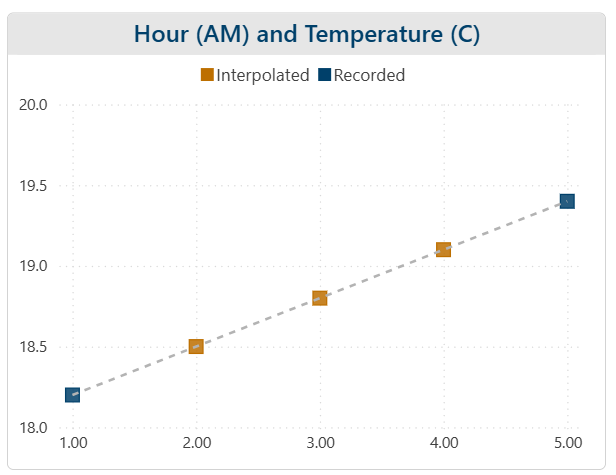
18.2°C at 1am, 19.4°C at 5am — the three hours in between are estimated, not measured, and it doesn't matter
And this isn't just "harmless" — leaving the gap unfilled actively causes problems of its own. A broken line on a facilities dashboard makes the real overnight trend harder to read at a glance, and can make three blank hours look like the anomaly worth investigating instead of the temperature itself. A 24-hour rolling average computed over only 21 real readings isn't neutral either — because the missing hours happen to fall in the coolest part of the night, dropping them instead of estimating them would skew that day's average warm, making the building look like it ran hotter than it did, purely because the coldest few hours went missing. And any automated system watching this feed — a "no data received" alert, a rolling-average threshold — has to treat a hard gap as an event worth flagging, which means three routine maintenance minutes can trigger a page for a problem that never existed on the building side at all. Filling this gap doesn't just avoid a distortion; it protects the dashboard, the average, and the alert system all at once.
How this looks in other departments
The same split — meaningful gaps you investigate, structural gaps you fill — shows up well beyond HR and a building's sensors.
| Department | The gap | The right move | Why |
|---|---|---|---|
| HR | 28 of 140 exit interviews never happened, concentrated among no-notice departures | Investigate – don’t impute a reason | A meaningful gap: the missingness is tied to why people left |
| Finance | A cost center’s expense submissions collapsed after a portal migration; its dashboard showed spend down 61% quarter over quarter | Investigate the pipeline, not the number | A meaningful gap: the “missing” spend wasn’t randomly missing, it was concentrated in exactly the team whose data pipeline broke |
| IT | A monitoring agent restart drops 20 minutes of per-minute CPU utilization logging | Interpolate with confidence | A structural gap: utilization moves smoothly minute to minute, and the restart has nothing to do with actual load |
| Real Property | Three overnight hourly temperature readings lost to a scheduled gateway reboot | Interpolate with confidence | A structural gap: the reboot is unrelated to temperature, and temperature changes smoothly hour to hour |
Finance's row is worth a second look, because it's the same trap as HR wearing different clothes: nothing about the visible spend figure is arithmetically wrong, and the drop looks completely real on the dashboard. The problem only surfaces once someone asks why Facilities Ops specifically stopped submitting reports the same month every other cost center kept submitting normally — the same diagnostic move that cracked the HR example open.
| If… | Then… | Because… |
|---|---|---|
| The gap is technical and the underlying value is smooth and continuous | Interpolate with confidence | The missingness carries no information, and filling it protects downstream averages, trend lines, and alerts from a distortion the gap itself would otherwise cause |
| The gap might be tied to the value itself | Don’t fill it in – investigate why it’s missing using whatever other fields you do have | Guessing a value erases exactly the signal the gap was carrying |
| You’re not sure which kind you’re looking at | Check whether the missing rate itself varies across a category that matters – department, shift, tenure, time of day | A gap spread evenly is more likely technical; a gap that clusters somewhere specific is a red flag that it’s meaningful |
| Either way | Note which rule you used, and why, right on the report or dashboard | The same dataset can need different treatment column to column, and anyone trusting the number deserves to know which choice was made |
The habit worth building isn't "always fill gaps in" or "never fill gaps in." It's asking, every time, whether the blank cell in front of you is background noise or the headline.
Try it yourself
Below is the same idea, live: pick a window of missing data in a scatter plot, then compare different ways of filling the gap and see how each one performs. If you want to open up the tool in a new window click here.
This demo actually demonstrates different types of imputation which depend on your underlying data. For the HR data we are choosing to not chart it so we are consciously choosing list-wide deletion. The other types of imputation - mean, regression and stochastic regression ultimately rely on your underliying data shape. In the sensor case a simple linear regression was a perfect fit!
Where this shows up beyond the dashboard
This is the same underlying habit the whole series keeps circling back to — knowing what a number is actually made of before you trust it — except this time the thing worth questioning isn't a value that's there, it's a blank that isn't. If your team has ever filled a gap in without asking why it exists, or left one unfilled and let it quietly distort an average or trip a false alarm, it's worth a look at which of these two cases you were actually in.
You'll find more of these interactive concept demos — descriptive statistics, base rates, outliers, regression and causation, and others — at tools.davhill.com.
Stephen Davies, DAVHILL Group. Connect on LinkedIn.