
Two Charts Telling Different Stories From the Same Data
Here are thirteen real numbers — the population of every Canadian province and territory. Sort them one way and Ontario leads a clean, descending staircase all the way down to Nunavut. Sort them another way and the chart looks completely different, even though not a single number has changed. The order you choose isn't neutral. It's one of the most consequential formatting decisions in a bar chart, and it's usually the one nobody consciously makes.
That's the trap this piece opens up that the first article in this series only had room to name: your visual system groups what it's looking at before you've consciously read a single value, using a handful of rules psychologists call the Gestalt principles. Sort order is one of them — Continuity, specifically — and it's worth starting with, because it's the Gestalt trap builders trip on constantly without ever noticing they've made a choice at all.
Five ways your brain groups a chart before you do
Gestalt organization is the third of the four perception stages behind this series (and behind DAVHILL's own Storytelling with Data course). Five specific rules get named for it:
Continuity — a sorted sequence reads as one smooth path; a jumbled one doesn't.
Proximity — things placed close together read as one group, things placed apart read as separate ones, regardless of what they actually mean.
Similarity — shared colour, shape, or style reads as "these belong together," even with no spatial grouping at all.
Focal Point — one element that looks different from its neighbours pulls the eye instantly, but only while it stays rare.
Figure/Ground — what counts as "the data" versus "the background" depends entirely on the contrast between them.
(Two more names sometimes get grouped under "Gestalt principles" too: Simplicity, which isn't really a rule of its own so much as the idea running underneath all five above, and Correspondence — in part the reliance on cultural association for example, the risk of leaning on red and green to mean "bad" and "good" — which shows up as a caution below rather than a full section of its own.)
The flagship: four honest ways to sort the same chart
Take the same thirteen numbers — population by province and territory, in millions, rounded from Statistics Canada's 2024 estimates — and run them through four sort strategies real reports actually use:
| Sort strategy | When it’s the right call | What happens to the eye’s path |
|---|---|---|
| Value, highest to lowest | Most of the time — a reader wants to know what’s biggest. | One smooth downward curve. Continuity, for free. |
| Value, lowest to highest | When the smallest value is the actual point — the worst performer, the thing that needs fixing. | Still smooth. Just running the other way. |
| Alphabetical | When the reader wants to find one specific item, not compare sizes. | Continuity deliberately broken — findability wins instead. |
| A fixed “natural” order (here, west to east) | When a familiar order the reader already carries matters more than the values themselves. | Jagged on purpose — a familiar map order outranks a value ranking here. |
Of the four, the smooth descending curve tends to get treated as "the right answer" almost by reflex — it's clean, it's got momentum, and it's what every default template hands you. But look again at the other three. Alphabetical order and the fixed west-to-east order aren't failed attempts at that same smooth line. They're a deliberate trade against it. A reader hunting for their own province doesn't want the path from biggest to smallest — they want Continuity actively broken in favour of a plainer, more predictable rule: the same one they already use to find things everywhere else, alphabetically or on a map. The "messier" line in those two sorts isn't a cost paid reluctantly. It's the honest signature of a chart doing a different job on purpose.
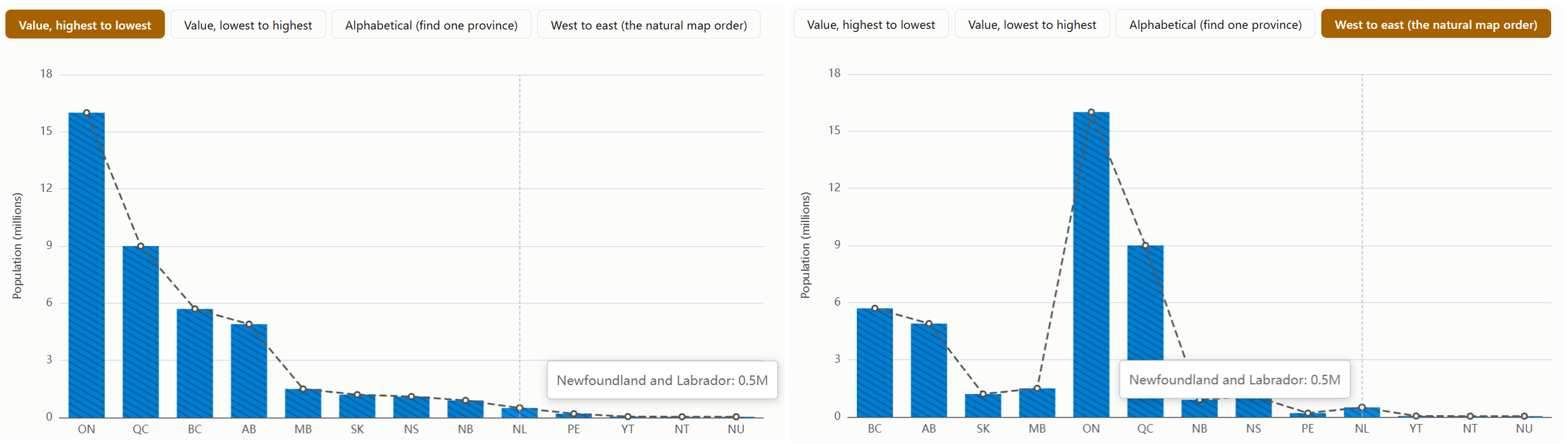
That's the real trap here — not picking the "wrong" sort, but treating Continuity (sort by value, get a clean line) as a rule to follow by default, the way a lot of report-building habit quietly teaches it, instead of a tool to reach for only when ranking is actually what the reader needs. Sometimes the stronger, more reader-centred move is to break the very principle you were taught to follow, because the reader in front of you needs something that principle was never built to give them.
There's a second layer here too, and it's the one that matters most once you've actually decided to break Continuity for findability: which findability sort wins still depends entirely on who's reading. For this chart specifically, aimed at a Canadian audience, geographic order is probably the faster of the two finds, not alphabetical — most Canadians carry a rough west-to-east shape of the country well enough to place Alberta before Manitoba without reading a single label, and that kind of spatial recognition is usually quicker than scanning down a list letter by letter. Put the same chart in front of an audience without that shared mental map and alphabetical would likely win instead, because the geographic shortcut simply isn't there for them to use. The lesson underneath the lesson: "sort for findability" isn't one move, it's a family of them, and picking the right one means actually knowing your audience — not just knowing that a rule exists to be broken.
The other four, in brief
Proximity. The same 16 numbers — tea sales by quarter and by region — can be grouped by quarter or by region, with or without a visible gap between groups. Whichever field sits closer together decides which comparisons are a glance and which mean jumping between separated clusters. Take the gap away and the same layout gets genuinely ambiguous, not just less tidy.
Similarity. Eight team members, with order (alphabetical vs. grouped) and colour (distinct vs. shared-by-team) toggled independently. Grouping by proximity alone works, but relies on the reader noticing where a gap falls. Colour alone works too. Stack both — teammates sit together and share a colour — and the two principles reinforce each other, which is exactly why the clearest charts often lean on more than one Gestalt principle at once instead of picking just one.
Focal Point. Click to highlight any number of bars and watch the exact moment "stands out" turns into "just another colour." One highlighted bar is a clean, unambiguous focal point. Two gets genuinely ambiguous. Three or more, and the highlight colour isn't rare anymore — you've accidentally built a second group instead of spotlighting anything. A focal point only works while it stays the exception. One caution worth carrying into any dashboard: choose a stand-out colour for what it means, not just for contrast — red instinctively reads as trouble and green as reassurance for many readers, and both are indistinguishable to some colour-blind readers. A neutral highlight colour paired with a direct label is the safer default.
Figure/Ground. The same eight bars, placed on four backgrounds — low contrast, medium, and two versions of high contrast, inverted from each other. Low contrast means the bars barely separate from the background, and reading the chart takes real, conscious effort before a reader even gets to the numbers. High contrast, light or dark, both separate instantly — dark mode is a legitimate choice, not a lesser one, it's just a harder design problem in practice, because everything else on the page needs its own dark-mode-safe version too, not only the bars.
So what do you actually do about it?
| If… | Then… | Because… |
|---|---|---|
| A chart’s sort order was never a deliberate decision | Ask whether this reader needs to rank things or find one specific thing — and be willing to break Continuity on purpose if it’s the latter. | A clean, smoothly sorted line feels like best practice, but it only serves a reader who’s comparing size. It actively works against a reader who’s searching. |
| Two things sit close together or share a colour on a dashboard | Ask whether you want your reader to read them as one group. | Proximity and Similarity don’t care whether the grouping is meaningful — only whether it looks that way. |
| A highlight colour is doing real work on a chart | Reserve it for one thing, and pick it for what it means, not just for contrast. | Every highlight past the first one quietly turns into “just another category,” and red/green defaults aren’t as neutral, or as colour-blind safe, as they feel. |
| You’ve decided a reader needs to find something rather than rank it | Pick the findability sort that matches how this specific audience already organizes that information in their head — geographic, org-chart order, alphabetical, whatever’s native to them. | Findability isn’t one move, it’s several, and the fastest one depends entirely on who’s reading, not on the data itself. |
Try it yourself
All five Gestalt principles above are live, interactive demos — not just described, but something you can click through yourself — at tools.davhill.com/charts/gestalt-principles. Step through the four sort strategies on the province chart and watch the dashed line change from smooth to jagged in real time. The rest of this series will keep working through the remaining perception stages the same way. If you'd rather build this skill directly with a group instead of piecing it together article by article, that's exactly what DAVHILL's own Storytelling with Data course is for.
Where this leaves you
Nothing in a bar chart "lies" by the strict definition — the numbers are real, the axis isn't truncated, nothing's been hidden. And yet the same thirteen numbers can leave a reader with a completely different impression depending on one choice made before the chart was ever shared: which order to put them in. That's the thing about Gestalt organization — it doesn't change the data, it changes which comparisons feel effortless and which ones feel like work, and most builders never consciously choose which effect they're going for. They just follow the rule they were taught — sort by value, get Continuity — without asking whether this particular reader actually needed a ranking, needed to find themselves on the chart instead, or — if finding themselves was the job — which kind of "find" their own instincts would reach for fastest. Sometimes the most reader-centred formatting decision is the one that deliberately breaks the rule, and getting it right the second time means actually knowing who's going to be looking.
Can you picture a report on your own team that's been sorted the same way since the day it was built, just because that's how it came out of the query? Can you guess what story a different, equally honest sort order might tell instead?
— Stephen Davies, DAVHILL Group. Connect with me on LinkedIn